The digital media course was precisely what I expected. The interesting and informative lecture classes, hands-on lab classes, with easy to follow tutorials and the creative projects, allowed for a great semester.
The lecture classes were very informative and provided myself with excellent background information about the programs and history of digital media. I think the use of the lecture classes was very important through the semester. I believe this because the classes built a knowledge of facts to coincide with the use of the program.
Lab class always seemed to challenge my creativity and put to use my technology apt skills. I found that the hardest part for my lab projects was finding my inspiration. I find myself scared to create new ideas and projects, but this class really pushed me to think “outside the box”.
I loved seeing and everyone finished projects. The pride, and relief of having finished each project always allowed for an interesting critique class. The passion each of my peers had dedicated to each project was very motivating to want to do well.
I do wish we had received marked rubrics and constructive criticism earlier from each of our final assignments. To not have any feedback to apply to the next project was difficult because I was not able to improve on those things that needed developing. I find that I personally take marks very subjectively, as the projects seem to be marked subjectively as well. To once have loved Flash and to have enjoyed spending hours creating an animation, only to receive a below average mark, with no rubric has created a once loved program to one of displease. I hobby making animations and editing photographs, and take much pride in every one of my final projects, because, I believe they were completed with enthusiasm and whole-heartedly. It is hard to see a project you are completely proud of, be under appreciated from someone who is supposed to encourage a career in Digital Media.
That expressed, I have loved working on each project. My understanding of each program was re-enforced through the tutorials and assignments.
The most important thing I am taking away from this course was that technology doesn’t always co-operate the way you want it too. There is no way to tell the computer exactly “I want this shade of pink,” or “I want this movement”, but there is ways to problem solve technology by practice of the program or forwarding or undoing and digging through each action. It took much practice and experimenting to get Photoshop filters to work the way I wanted, or movements in Flash to happen perfectly. At least there is an “undo” key.
Monday, November 24, 2008
Adobe Photoshop
I love taking photographs. I love capturing moments and freezing time. I love being able to see those moments and remember the memories. But sometimes, the photographs don’t always turn out as the moment did.
Sometimes, the flash doesn’t work. Sometimes, red-eye can’t be ignored. Sometimes, pimples seem to stand out more than a smile. It is for this reason that I have come to love not only taking photographs, but also editing them using Adobe Fireworks.
This semester in our Digital Media lab class, Adobe Photoshop was introduced to us. This common, easy-to-use, graphic editing software has seemed like a tool that parallels with the capture button on my camera.
Adobe Photoshop is an editing software program that allows users to expand, explore, manipulate and create images to come alive. The architect of Photoshop was a graduate engineering student. Photoshop allows users to erase, re-define, and organize elements of old photographs as well as re-construct new photographs. Many visual inspirations are built using Photoshop. Large advertising companies use Photoshop to make solicit products and events.
Using Photoshop users can apply many tools to create the perfect picture. Some tools are the vector tool. The vector tool is used to draw shapes or characters. The filter tool is used to allow images to appear with accented features, or the text tool to bring words into a shot.
Photoshop today has allowed me to make posters for school events, as well as joking around with family, like putting my brother’s head on Elmo’s body.
Characteristics of Web 2.0
This week in class we discussed five different characteristsics of Web 2.0.
Characteristic #1
http://www.gowindowslive.com/Mobile/Landing/Home/Default.aspx?locale=en-CA
Dynamic content is the first characteristic of Web 2.0. Dynamic content is the ability to access the web on more than one platform. An example of dynamic content is Windows Live for Mobile. The ability to access Windows Live from your cell phone, computer, blackberry or other device qualifies it as characteristic one of Web 2.0.
Characteristic #2
http://www.country953.com/
The second characteristic is user contribution. User contribution is considered a website in which the user can apply their own input or content onto a site. An example of a website that allows for user contribution is the website for the radio station 95.3 Country FM. This radio stations website allows users to enter contests and add input to DJ’s blogs.
Characteristic #3
http://www.eharmony.ca/singles/servlet/registration?cid=55206&aid=1001&kid=GOG0033974536
Social media is the third characteristic of Web 2.0. Social media is considered as a website that allows users to network and communicate. Social media sites allow users to sign on identities and personas. An example of a social media site would be Eharmony.ca. This website allows users to sign up as singles and network for relationships.
Characteristic #4
http://www.addictinggames.com/index.html
Characteristic four is online applications. Online applications are qualified as websites that are run through the web instead of downloaded to a personal computers hard drive. An example of this is addictinggames.com. This website allows users to play video games online instead of having to download the game or program it onto the computer.
Characteristic #5
http://www.flickr.com/
The final characteristic of Web 2.0 is harnessing collective intelligence. Harnessing collective intelligence is the idea that users apply input like crowd-sourcing and tagging. An example of harnessing collective intelligence is Flickr.com. This website allows for photos to be tagged with more than one name.
Sunday, November 9, 2008
Finished Flash
My Artist Statement
I had been sitting on the bus when we reached the first stop and a woman with a dog got on. There was much tension and arguing from the back of the bus, while the woman with the dog and another woman bickered about an animal riding the bus. At the next stop a young boy got onto the bus and saw the dog. So excited and surprised a dog could be riding the bus, he announced, “A dog on the bus! How unusual!” This was the inspiration for my Flash assignment. I decided to adapt this idea into a children’s story. I have a giraffe and a cow riding the bus while a child sees the animals on the bus and says “How unusual!” The last scene completes the humour of the story. This time it is the child seen riding the bus and the animals surprised.
The goal for my Flash animation was to make a video a child would like. My idea was to make a short animation, demonstrating multiple skills learned throughout the lab class. I had the intention that my Flash animation would be a silly video that could air in-between television shows, on a children’s television network like TVO Kids.
The program I used to create this animation was Adobe Flash. The easiest part of this assignment was creating my idea. After establishing my idea, I created a rough layout of time frames and the storyline. Once I went to work, I was unsure of the type of images I wanted to use. I decided it would be best and most child-like if I drew the pictures. I used the vectors tool, the pencil tool and the brush tool the most frequently. The brush tool was very handy, because it estimated your drawing outlines and then created a smooth curve, creating a more cartooned look. There were many tutorials explaining Flash in great-detail, and because of this I found little challenge. The hardest
part was creating a “play” button. I seemed to follow the tutorials step-by-step, but for some reason there was always a “script error”, resulting in defective buttons. It was at this point when I felt very frustrated. I thought it would be best if I left the buttons for another day. Sure enough, after leaving and coming back to work on the animation, I attempted once again to insert buttons. They ended up working perfectly.
This project really taught me about patience. While using Flash I learned that when something does not work properly again and again, it is personally best for me to take a step back and then approach the project from a new angle.
Building my animation was an admiration experience for those who work with Flash daily. I have seen animations since I was a kid, but never knew how much time and dedication constructing one required. My appreciation and respect for animators has positively changed from having been in their shoes.
I do believe that my Flash animation hits my target audience. I think the childish drawings, the fun music, the easy to read words, and the plot of the animation, all appeal to kids. My animation did meet my expectations and original intent. Overall, I am excited and proud of what I have produced.
Sunday, October 26, 2008
Album Covers
 *http://www.alexsteinweiss.com/as_index.html
 *http://www.amazon.com/Apathetic-EP-Relient-K/dp/B000BM7YK6
The music business was revolutionized in 1923 when Alex Steinweiss invented the concept of Album Covers. The first album cover is a painting by Alex Steinweiss himself. The second is from a contemporary band Relient K. I find there are many aspects represented in each cover that remind me of one. I find the covers polar opposites; the industrialized city of Steinweiss' versus the natural environment of Relient K's cover.
Wednesday, October 15, 2008
The Wheels On The Bus Go Round And Round
This week in our Digital Media lab I began to work on my flash animation. I have drawn the bus and made the wheels turn. I also elaborated about a dog riding the bus. Instead of it being ordinary pet animals, I have started drawing giraffes on the bus. I drew a cow on the bus. I am going to draw a bear on the bus. I think the end of the story will be resulting in the animals proclaiming, “A child on the bus? How unusual!”
It took me a long time to understand how to make the buses wheels rotate while making the body of the bus not. I didn’t realize I would need to make a separate layer for each wheel. This was the biggest obstacle this week while using flash. I now understand how to make the wheels rotate.
I also thought drawing on flash with the brush tool was going to be more challenging. Flash seems to assume your drawing edges and then creates soft-edged lines. This looks much more smooth and professional than my usual jagged drawings.
Monday, October 13, 2008
FLASH!
This past Sunday, my bus ride home from work happened to be a tad more eventful than the usual routine. Seating myself I noticed the older gentleman in-front of me doing the daily crossword, the red-haired women to my left gazing out the window, the teenage boy behind me shuffling songs on his Ipod and one middle-aged woman sitting surrounded by bags. Reaching the next stop a third woman and her dog got onto the bus. I have never seen a dog ride the bus before and hid a smile, as she brushed past. All of a sudden the bag woman and lady with her dog started screaming at one another. The bag woman was complaining about the dog being on the bus while the other woman was yelling back in defence. While both women were still shouting, the dog smelt the ground around him and we arrived at the next stop. A little boy with freckles jumped excitedly down the aisle then realized there was an animal. Stopping in his tracks, eyeing the dog up and down, he then pro-claiming, “A dog on the bus? How unusual!”
It is this bus ride that I am going capture in my flash animation. I plan to create a flash video, which tells the story of a child watching different animals ride the school bus.
In class we watched an example of a video using text and music. This has inspired me to use text and computer-drawn graphics to tell a children’s story. I am going to have to draw many graphics for this animation and add layers of text and music. I plan for the story to be read, not told, so I won’t have to record someone reciting the animation’s text. I am going to use different motion tweens and rotations to make the buses wheels turn and move along the road. Maybe I will have the animals do different actions if you place the cursor over them. For this I would have to use the button application.
Sunday, September 28, 2008
Splash Around
Artist's Statement
The concept for my poster assignment is a public announcement to promote healthy living. My goal is to encourage families to spend summer outside, being active and energetic. The targeted audience for my ad is children, teenagers and adults. Although the ad aims to show swimming as a summer activity, the message from the ad is to just spend time outdoors.
The program I used to create this poster was Adobe Photoshop CS. I anticipated some challenges with this project, such as getting my creative spark. I found that it took me much longer to think of an idea than it did to actually make the poster. Certain obstacles that occurred with the Photoshop program were creating a textured type as well as creating a choppy flow throughout the ad. I had originally planned to place pictures inside a different script, but the ad seemed to busy once I managed to accomplish this. I found that I wanted to place a filter on the text but I did not know you had to rationalize the text first. After playing around with settings of the program I learned of how to emboss the text. Flow throughout the ad was also another obstacle. I had to edit and erase many different parts of the original picture and in doing so I created a very blocky poster. I dealt with this issue by letting the background be a gradient of the same colour blue as the water. The illusion is now that the water goes on and on instead stopping and meeting the sky.
From this project I learned that everything comes with playing around with ideas. The original idea I had for this poster seems like an entirely different thought from this final project. Playing with the program settings was the way I learned how to deal with problems and technological stubbornness. Different sparks of creative flair would arise as I would learn something new about the program’s tools so I would morph my project to adapt to the new idea.
I do believe this ad successfully hits the target audience. No matter one’s age, race or gender, anyone can swim. The poster features a vast difference of people all seeming to love being in the water. The positive picture of people loving the water creates a feeling of wanting their happiness for oneself, which also re-enforces the message of spending time outdoors.

Typography
I have always had an obsession with drawing different kinds of letters. I used to be able to sit through an entire math class and fill paper after paper just doodling each peer’s name. When I was younger, my mom would write our names in big block letters and we would colour them with different patterns and shapes. So, this week when we had a lecture on typography I felt a little closer to home.

Lipstick Jungle
The font used for NBC’s Lipstick Jungle is very effective for soliciting their show. The letters seem to be very elegant. The length of the L, P, K, J and G also highlight the stereotypical model-like look: women, tall and petit. The letters that hang can also be associated with the word ‘jungle’ because of hanging vines. The round shape to each letter is bold but warm. The letters are chic and appear stylish on the poster. The typography used is definitely efficient because it is appealing to women in high fashion.

Impossible Is Nothing
The letters used in this advertisement for Adidas make a bold statement. The all-capital letters show force and drive. The message written from Adidas about the word ‘impossible’ is delivered strongly in the white writing clustered together in the center of the page. This ad targets every sports enthusiast. The ad also aims to motivate people to surpass the known. The inspirational message keeps the readers attention because of the easy- to- read lettering.

Superspeed Tunnel
The letters in Disneyland’s Tomorrowland advertisement draw the reader into the poster. The way the letters are leading back into the frame, the lines that are pushed from the top and the slant and angle of the words emphasize what the ad is for. The lettering suits the advertisement because the words themselves show motion and speed. The ride showcased is called “Peoplemover” and the word itself creates the illusion of moving across the page.
Monday, September 22, 2008
A New Colour
The Depth Of Crayons
Monday, September 15, 2008
CRAP Principles
CRAP Media
This week during my Media Production class I learned all about the CRAP Principles, first introduced by Robin Williams. The CRAP Principles are used for design; they are to help one’s website, poster, advertisement, song, (etc.), stay organized, easy to process, eye-catching and sharp. The CRAP acronym represents Contrast, Repetition, Alignment, and Proximity. This ideology is displayed in the following photographs.


This week during my Media Production class I learned all about the CRAP Principles, first introduced by Robin Williams. The CRAP Principles are used for design; they are to help one’s website, poster, advertisement, song, (etc.), stay organized, easy to process, eye-catching and sharp. The CRAP acronym represents Contrast, Repetition, Alignment, and Proximity. This ideology is displayed in the following photographs.
Walt Disney Pictures: Enchanted <http://www.aolcdn.com/moviefeatures/enchanted-poster-433>
The Enchanted movie poster from Walt Disney Pictures demonstrates every CRAP Principle.
Contrast: Contrast is shown through colour and font. The top of the poster and the bottom reflect opposites of one another. The complimentary colours and differing feelings of dark and light and fierce and welcoming help show contrast. The curved style of the title stands almost 3D where as the tagline is spread straight across the top of the ad. The different sizes of the name and slogan demonstrate contrast.
Repetition: The colour gold that is used for the title is also used for the tagline. The font for the name and slogan are also the same. The buildings that line the left- hand side of the poster are paralleled on the right-hand side. The glowing aura behind the moon is also repeated around the characters.
Alignment: The arrangement of the credits is built as a pyramid at the bottom of the poster. This alignment is creative, interesting and works well for the child targeted ad.
Proximity: The Disney designer seems to have grouped not only colours and words together, but also characters. Without even having seen the movie one would know that the woman at the top of the page to be the “bad guy” and the characters at the bottom to be the heroes. This use of proximity helps to explain what the movie is about.
Revolution Studios: Across The Universe <http://www.postergeek.com/albums/userpics/poster_across-the-universe.jpg>
The movie poster for Across The Universe demonstrates the CRAP principle of contrast. Stars of a white shade illuminate the dark blue night sky. The small size of font for the tagline allows the title to jump off the page. Repetition is shown through the melted blue sky and again in the strawberry. The idea of a solid colour fading is shown in the background of the sky (blues) and in the forefront strawberry (red).

AT&T Advertisement (In-Touch Magazine)
This advertisement demonstrates Proximity, Repetition and Alignment. The words are all grouped together and aligned in the top right hand corner. The colour orange of the words is not only is contrasted with the black background, but is also repeated from the bottom of the AT&T logo. The thick, round-edged box highlighting the AT&T logo is also used to advertise the Goo Goo Dolls newest track. The black and white photograph of the band is also repeated of the white guitar and black background. The words are also aligned to the top right corner. This creates an easier, quick read.
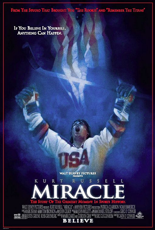
Walt Disney Pictures: Miracle <http://www.impawards.com/2004/posters/miracle.jpg>
The Miracle movie poster displays contrast in colours. The red, blue and white not only contrast one another but also represent the United States. The highlighted title of Miracle is repeated with the illuminated hockey stick and flag. The same font is also used for the tagline and title. The diverse sizes of fonts are aligned down the bottom of the center of the poster. These ranges of sizes help to the reader see the important details promptly. Proximity is arranged by having all the objects grouped down the middle of the poster.
These movie posters and advertisements demonstrate all the CRAP Principles I have learned throughout the course so far. Now, after analyzing each advertisement it’s my turn to apply the CRAP Principles when I create my own poster.
Tuesday, September 2, 2008
Is The World A Digital Domain?
Learning About A Digital Era.
Yesterday, the first day of my newfound career at Ryerson University, began with an uncertainty as to the term "digital media". The thought of television, computers and movies crossed my mind. Animated films, commercials, and other visual graphics that move and change seemed to reel over and over the idiom "digital media". The bubble of gadgets and entertainment was erupted when a boy from a few rows back explained the phrase "digital media" meant using coded numbers zero and one.
Digital media seems to provide a great source of amusement to the world. The growth of these digits expanding and providing has seemed to help forward our technological age. As opposed to analog, the original "second-hand" clock, digital has always appeared to be easy and more-advanced. My impression of "digital media" has expanded beyond the ordinary thought of cell phones and CDs, but to a world of wonder and marvel to learn about this digital working. How many ways can an infinite number of zeros and ones be arranged? And how do these numbers become processed into digital art?
Upon graduating and attaining the ability to produce digital forms of communication and leisure activity, the thought of the "behind- the - scenes" look at how digital media comes together seems only crucial. As a student of the Radio and Television industry, the digital media study and examining could potentially help further the knowledge for a student to better be able to influence the masses of whom one would be entertaining and informing.
Subscribe to:
Comments (Atom)
