This week during my Media Production class I learned all about the CRAP Principles, first introduced by Robin Williams. The CRAP Principles are used for design; they are to help one’s website, poster, advertisement, song, (etc.), stay organized, easy to process, eye-catching and sharp. The CRAP acronym represents Contrast, Repetition, Alignment, and Proximity. This ideology is displayed in the following photographs.

Walt Disney Pictures: Enchanted <http://www.aolcdn.com/moviefeatures/enchanted-poster-433>
The Enchanted movie poster from Walt Disney Pictures demonstrates every CRAP Principle.
Contrast: Contrast is shown through colour and font. The top of the poster and the bottom reflect opposites of one another. The complimentary colours and differing feelings of dark and light and fierce and welcoming help show contrast. The curved style of the title stands almost 3D where as the tagline is spread straight across the top of the ad. The different sizes of the name and slogan demonstrate contrast.
Repetition: The colour gold that is used for the title is also used for the tagline. The font for the name and slogan are also the same. The buildings that line the left- hand side of the poster are paralleled on the right-hand side. The glowing aura behind the moon is also repeated around the characters.
Alignment: The arrangement of the credits is built as a pyramid at the bottom of the poster. This alignment is creative, interesting and works well for the child targeted ad.
Proximity: The Disney designer seems to have grouped not only colours and words together, but also characters. Without even having seen the movie one would know that the woman at the top of the page to be the “bad guy” and the characters at the bottom to be the heroes. This use of proximity helps to explain what the movie is about.

Revolution Studios: Across The Universe <http://www.postergeek.com/albums/userpics/poster_across-the-universe.jpg>
The movie poster for Across The Universe demonstrates the CRAP principle of contrast. Stars of a white shade illuminate the dark blue night sky. The small size of font for the tagline allows the title to jump off the page. Repetition is shown through the melted blue sky and again in the strawberry. The idea of a solid colour fading is shown in the background of the sky (blues) and in the forefront strawberry (red).

AT&T Advertisement (In-Touch Magazine)
This advertisement demonstrates Proximity, Repetition and Alignment. The words are all grouped together and aligned in the top right hand corner. The colour orange of the words is not only is contrasted with the black background, but is also repeated from the bottom of the AT&T logo. The thick, round-edged box highlighting the AT&T logo is also used to advertise the Goo Goo Dolls newest track. The black and white photograph of the band is also repeated of the white guitar and black background. The words are also aligned to the top right corner. This creates an easier, quick read.

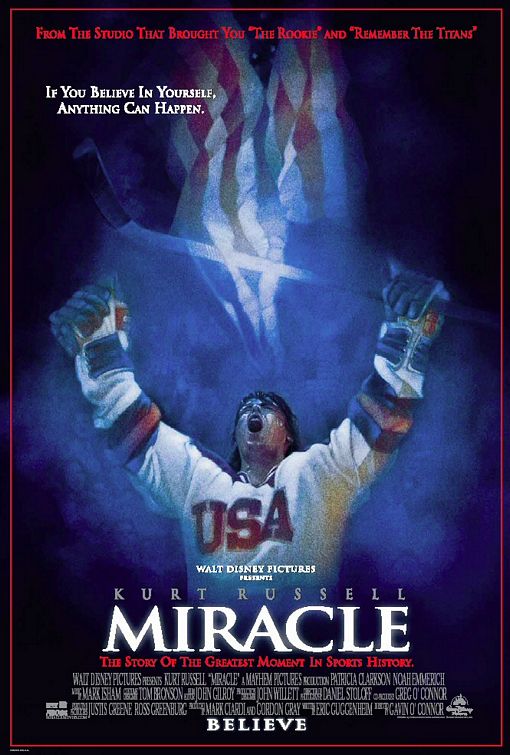
Walt Disney Pictures: Miracle <http://www.impawards.com/2004/posters/miracle.jpg>
The Miracle movie poster displays contrast in colours. The red, blue and white not only contrast one another but also represent the United States. The highlighted title of Miracle is repeated with the illuminated hockey stick and flag. The same font is also used for the tagline and title. The diverse sizes of fonts are aligned down the bottom of the center of the poster. These ranges of sizes help to the reader see the important details promptly. Proximity is arranged by having all the objects grouped down the middle of the poster.
These movie posters and advertisements demonstrate all the CRAP Principles I have learned throughout the course so far. Now, after analyzing each advertisement it’s my turn to apply the CRAP Principles when I create my own poster.

No comments:
Post a Comment